Below are some resources for you to use for your social media efforts. The files are for Facebook and Twitter. The sources files are .PSD files (Photoshop) they are layered and do require Photoshop software to manipulate. They should work in every version.
Twitter Cover Photo
Your Twitter cover photo should be your agency logo. If you don't have a logo then consider using the Maryland Flag or State Logo with your agency name incorporated. Keep in mind that in your feed the image will appear very small compared to the image you see at the top of your page so simple is the key here. Below is a sample of what is in the Photoshop file. I have the State Logo and Maryland Flag included in the artwork in case you want to use it. I also included a type layer and box layer to add a name if you wish. If you'd like to make your own with just the template, simply delete all the layers or turn them off.
Twitter Background Image

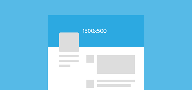
The Twitter background image spans the top of your home page. The size is 1500 x 500. You have a bit more leeway with this image. It can/should change often and can reflect what's going on with your agency at the time or it can be seasonal. Feel free to have some fun with this one, just be sure that images you use are ones you own and that they are large enough to fill the space without stretching the image.
The
Photoshop file has guides to help place the photo. The ones at the top and the bottom are important. Even though the dimensions call for 1500 x 500 the top and bottom actually get cut off a bit when you implement the graphic in Twitter. Also remember that the area where the green box is will be where your profile image will be and it will cover anything on the background photo.
Facebook Profile Picture
 Your Facebook profile image should be treated the same way as your Twitter graphic. It should be your agency logo or identity. Again, it will be in your timeline as a thumbnail so it should be simple and easy to identify.
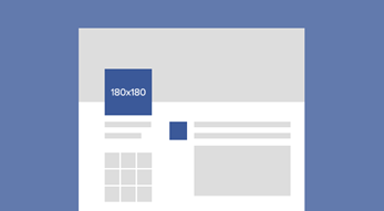
Below is a sample of the Photoshop file and what it should look like. If you don't have an agency logo they use the Maryland Crown logo, with and agency acronym or short name. In Facebook your agency name will be up top over your cover photo so it's not as important that you have the name in the profile pic.
Facebook Cover Photo
Your Facebook cover photo is pretty straightforward. The trick here is to figure out what is covered by the other elements that make up the cover photo area of the page. Below is a sample of the
Photoshop file and what areas are taken up with things like your profile picture, your agency name, and the share and like buttons. The green box again shows where the profile picture is located. It will totally cover the image behind it. The lower green line (by his foot) will be where your agency name is and buttons. If your agency name is two lines then it will shift up and take up more space. The text will be over the image but won't completly cover things. But, the text is white so make sure that the image you're using will contrast the text and not make it unreadable.